Trend colours for 2026, according to Pantone and other paint brands
Every year, the big names in paint and decoration dictate colour trends. In 2026, the mood is one of a return to balance, soothing nature, and shades that nurture well-being. Whether you’re planning to paint a single accent wall in a trendy colour or completely redecorate your interior, here are the colours that will define next year’s style.
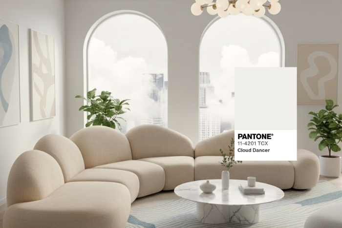
1. Pantone: Cloud Dancer
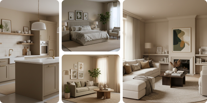
The Pantone Colour of the Year 2026 has surprised many... or as some would say, the absence of colour! Yes, Pantone has chosen an airy white for 2026: Cloud Dancer PANTONE 11-4201. This shade offers a true visual refuge, inviting reflection, creativity, and relaxation, like a breath of tranquility in an often overly noisy world. Highly versatile and luminous, Cloud Dancer pairs beautifully with natural and pastel tones to create soothing atmospheres, or with metallic accents and glass for a modern, light effect.
Why it works:
- Creates a serene environment conducive to concentration.
- Adapts to all styles and colour palettes, but pairs perfectly with pastel tones.
Ideal use:
- In bedrooms to promote rest and mental clarity.
- In office spaces to encourage creativity and concentration.
- On walls, accessories, or textiles, alone or combined with pastel colours or natural materials for an airy, luminous effect.
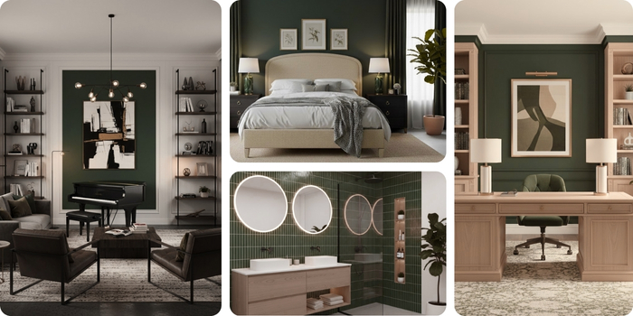
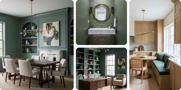
2. Sico: Boreal Forest
Nature is no longer just a source of inspiration—it has become a necessity in modern interior design. At Sico, this need for roots and cohesion is reflected in Boreal Forest (6167-83).
This deep, rich green goes beyond mere decoration: it invites you to bring the resilience of Canada’s great outdoors into your everyday life. This shade works equally well in soothing environments enhanced by natural textures such as wood and linen, and in modern spaces accented by bright elements such as chrome and glass.
Why it works:
- Universal and sophisticated, it harmonizes with raw materials (wood, linen, stone).
- Creates a playful and regenerating environment that promotes balance.
Ideal use:
- In bedrooms to promote rest.
- In office spaces for a focused and calming atmosphere.
- Can
be combined with glass and shiny metals for a feeling of lightness.
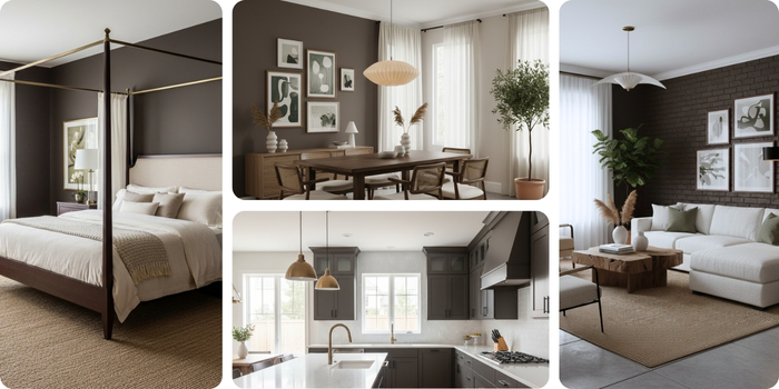
3. Benjamin Moore: Silhouette
At Benjamin Moore, the trend for 2026 is moving toward an enveloping, classic shade. Their choice, Silhouette AF-655, is a warm, rich taupe grey that symbolizes grounding, understated luxury, and the need to create a personal sanctuary at home.
Why it works:
- Adds richness and depth to any space.
- Easy to incorporate, it can be used as a dominant or accent colour.
Ideal use:
- In social spaces (living room, dining room) to encourage conversation and intimacy.
- On modern kitchen cabinets for a refined and timeless look.
4. Sherwin-Williams: Universal Khaki
Sherwin-Williams has selected a colour that celebrates understated elegance and serenity: Universal Khaki (SW 6150). This warm neutral, between beige and grey (greige), exudes a rich texture and rare adaptability. It evokes timelessness, warmth, and solidity.
Why it works:
- Perfectly anchors a space and serves as a backdrop for all other colours.
- Particularly compatible with natural textures (wood, rattan) for a warm Japandi or minimalist style.
Ideal use:
- In the entryway to create an airy and inviting atmosphere.
- Perfect for pairing with natural textures and creating warm ambiances.
5. Behr: Hidden Gem
Behr introduces a shade that exudes quiet confidence. Hidden Gem is a smoky jade imbued with an air of mystery and sophistication. This rich, dynamic colour helps create spaces that inspire both stability and energy.
Why it works:
- Soft and captivating, it adds depth to every detail.
- Lends itself to different finishes: matte for walls, satin for woodwork.
Ideal use:
- Interior walls in living rooms and dining rooms.
- Woodwork and fireplaces to create elegant and serene spaces.
- In bathrooms to create a dramatic effect.
2026 in colour: create spaces that soothe, inspire, and reflect your style
In 2026, colours no longer just decorate our walls: they tell a story, set a mood, and influence our daily well-being. From Pantone Cloud Dancer to deep greens and sophisticated neutrals, each shade invites you to create spaces that are soothing, inspiring, and conducive to stability. It’s up to you to choose the one that best reflects your vision, and don’t hesitate to find inspiration on Centris.ca: who knows, maybe some visionary homeowners have already used similar shades!

See also:
Inspiration and practical tips for modern kitchens